I’m planning my 2021 EP releases, and I have the cover done for the first. I have 8 songs total to share this year, but I feel like the songs came together into two distinct tones and themes, so I split the group. In this case, the “Who’s Pulling My Strings” EP is hooky, with warm open vocals over rock songs inspired by country, blues and pop. It has a larger sound, with two tracks recorded as a full band.
The songs are about wanting to understand a situation that you don’t have control over, and the sadness and anxiety that comes from powerlessness. At the same time, there can be joy when getting to rock bottom, because you can really see yourself. You can leave behind the things that won’t help you anymore.

These songs were recorded between 2016 and 2018 and were written about what was happening inside of me. Now, after 2020, I feel like they are also about things happening outside of me–the pandemic, the murder of George Floyd, the city burning, isolation and depression. How could a person survive this year without anxiety?
The cover shows a screenshot placed over a photo I took of some rolled fiber matting. I liked the way it looked right away because it reminded me of a black pit with stalagmites growing around, or the cells on inside of a digestive tract. The font looks fat and similar in shape to the pokey bits.
My husband Ryan said that it reminded him of the Sarlacc pit that Boba Fett falls into in Return of the Jedi. Fair enough. I won’t argue (maybe just because I am a closet Star Wars fan-fiction writer).

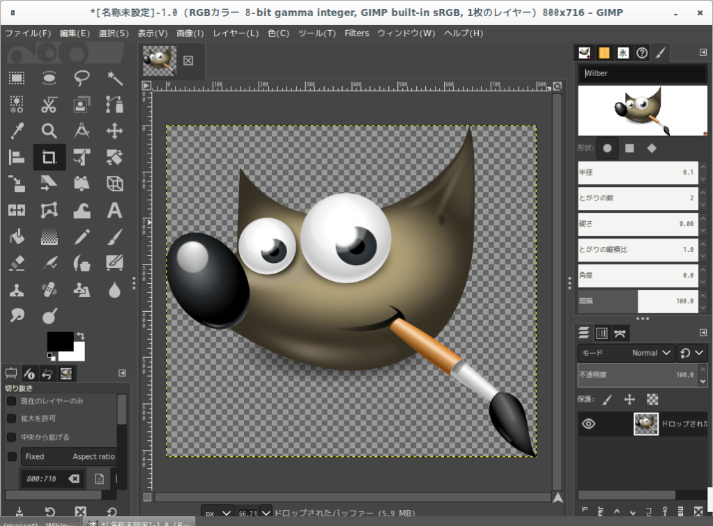
I designed the cover in GIMP 2.10, GNU Image Manipulation Program (GIMP). According to their website, “GIMP is a cross-platform image editor available for GNU/Linux, OS X, Windows and more operating systems. It is free software, you can change its source code and distribute your changes.”
I knew I needed to learn how to use photo editing tools for this cover. When I got help from a graphic designer for the cover of Alphabetically, my first album, there were days of emails back and foreth like this:
Clare: can you move the font for the title up a tiny bit?  Like a millimeter?

Designer: of course!  How is this?

Clare: Now it appears too high... can you move it down a tad?

Designer: Of course!  I think this might be the one 😊

Clare: I’m not sure— Let’s now try centering the font between the edge and the photo instead...
GIMP 2.10

I decided to try GIMP because it was free and on several top ten lists. I figured to try the free software first, then pay for one if I had trouble picking it up. The learning process for the interface was frustrating at times, especially using and coloring fonts.
My cover is relatively simple, with just two images (colorized in other programs) layered on top of each other topped with a font. While figuring things out, I would sometimes have to take multiple breaks due to frustrated rage. I couldn’t figure out how to bucket fill a rectangle selection with paint, and I eventually had to take a few days off to get some perspective.
But, realistically, I could have started out with watching video tutorials, instead waiting until I hit a wall before viewing them. The whole project took me about 12 hours. Overall, I am happy with GIMP and would definitely recommend it to other artists who have simple layering to do.

Collections
Toss a few bucks in the open guitar case.
$1.00
